onePA - Website redesign
Background
The People's Association (PA) was established on 1 July 1960 as a statutory board to promote racial harmony and social cohesion in Singapore. Their mission was to build and bridge communities in achieving one people, one Singapore, which led to the name of the website, onePA. Whereby, onePA is a community website that offers a one-stop access to PA's courses, activities, facilities, interest groups and memberships.
Overview
This re-design of onePA website was done as a group project. Our goal was to redesign the current onePA website such that there would be more consumer engagement, increasing the sign up rates for all that onePA offers and to help achieve onePA’s mission statement. With many competitors in the market, thorough research and analysis had to be done to ensure onePA website gets the edge among the rest.
The challenge
In this team project, the challenge was to ensure onePA website gets a high engagement rate and increased signup rates for its courses. This is because based on our user research we found out that often people feel, the current standards of all that onePA offers are either not reliable or effective enough to feel the need to keep going for the course and even to recommend it to others.
My Role
UX research & UX design
Duration
2 weeks
Client
onePA
Tools
Canva, Figma, Miro, Optical workshop, Zoom.
Design Process and Design Thinking
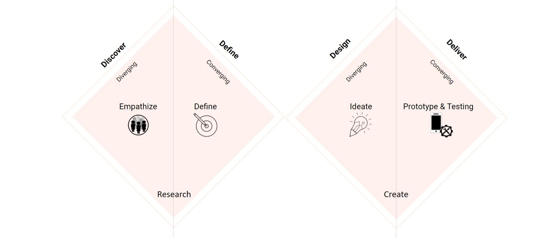
Our team, took on the double diamond design approach to tackle the re-design process. We aimed to incorporate the key phases of Discovery, Definition, Design and Delivery throughout the process. Whereby we went into Discovering user problems, Defining specific user problems, Designing potential solutions to these problems and lastly Delivering feasible and viable solutions.
Also under this double diamond process we took on the 5 key stages of design thinking. The 5 key phases of design thinking are, Empathize (learn about the audience for whom you are designing), Define (construct a point of view that is based on user needs and insights), Ideate (brainstorm and come up with creative solutions), Prototype (build a representation of one or more of your ideas to show to others), and Test (return to your original user group and testing your ideas for feedback).

Discovery phase
User Interview
Objective
To discover people's needs and wants regarding their behavior pattern towards courses and facilities offered in their communities.
Demographics
13 Interviewees
Aged between 25 - 60 years old
5 males and 8 females
From varied professions
Key insights
“I like a seamless browsing and sign up experience.”
“I feel like it is troublesome to navigate across the site and apply for a course currently.”
“I do not feel too assured about the courses offered by onePA.”
“I can’t seem to find any reviews about the course or instructor by the past participants.”
Affinity Mapping
Affinity mapping was done to gather key insights from the user interviews.

Competitive Analysis
To gain an understanding of what’s in the market right now, we conducted comparative and competitive research with 5 competitors (3 direct and 2 indirect competitors). Our goal was to compare and identify common features across these sites and potential opportunities for onePA to differentiate itself. More focus was on competitive analysis - particularly, the positives (what has been done well) and the negatives (what could be improved). The most important takeaway from this activity was learning how different websites organised their content and the overall layouts they used for those websites. These are the features that stood out and we considered adding to the current site.
Filter Function
We adopted the top filter functionality used by HometeamNS, ASOS and ActiveSG. To give onePA site a more modern and cleaner look, as the existing website’s side filter functionality looked too cluttered and messy.
Recommendation section
Based on the recommendation sections on the various sites shown above, the main takeaway was to have the recommendation section or label to be placed in a more obvious position that catches the eyes of the users.
Checkout process
Both ActiveSG and Zalora have a one-page checkout process, creating a seamless experience for users. Since our users wanted a seamless experience as well, this feature was adopted as well.
Define phase
Card sorting —> Information Architecture
The next step of our design process would be the defining phase. In which we wanted to develop an effective navigation system by conducting a card sort, a user research technique to tap into people’s existing mental models. Based on our user interviews, we noticed that most users are looking to learn a new sports activity. However, they found it difficult to navigate the current site and overall, found it to be an overwhelming experience. With 9 pre-existing categories and a total of 80 individual sports, we conducted a closed card sorting exercise where participants had to sort each individual sport into these predetermined categories. This helped clarify whether those categories were logical to the majority of users before we began to move forward with our re-design. With the results of the card sort, we created an information architecture map so that the users could navigate through the sports categories with ease.

Meet the personas
User Journey
User journey helped us to visualize user’s goals and the emotions they go through while completing certain tasks. It then helped us to narrow down the problem based on the users pain points.
Problem Statement
Users need access to credible & reliable one stop shop platform for attending courses & joining interest groups because they currently find it difficult to search on multiple avenues for suitable options online.
How Might We
ensure users feel assured to book a course in onePA website?
How Might We
help users make better decision in their choices on onePA website?
How Might We
help users have a seamless end-to-end booking experience and ease of navigation on onePA?
How Might We
ensure users are able to find for what they are looking for with ease.
Solution Statement
Users should feel more assured signing up for onePA courses & events, now that they have access to reliable reviews and ratings from verified participants and proper instructor information for them to read before signing up for anything. They can now be more efficient in their research due to simplified navigation across the site.
Design Phase
User flows
User flows were created based on their persona to better understand the user needs.
User flow scenario for learner Linda - this user wants to get back in shape and is recommended the fitness courses in onePA. Learner Linda likes to fully proof read everything before signing up for anything.
User flow scenario for sociable Sam - 2 flows for this user. One, they are looking for a new interest group to join randomly, two they are looking to join an interest group related to their past event attended.
Sketches
Based on the user flow we managed to create some sketches of our website pages. The sketching process was done by all 5 of us in the team in a design studio setting and format.

Wireframes
By performing the design studio sketches, our team came to a consensus with a finalized sketch that was made into wireframes.
Delivery Phase
Prototyping
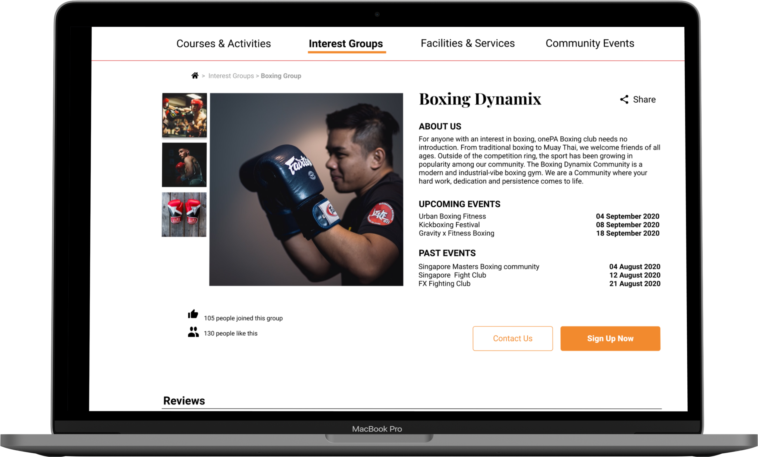
The wireframes were then made into a prototype. Careful selection of color palettes and font types in alignment to existing onePA branding.


Prototyping
Existing onePA website
“The Search bar is not noticeable in the Hero Image. Overall a very bad experience!”
“The list is too overwhelming. There’s just so much options going on.“
Prototype of new onePA website
“ I liked the ease of use compared to the actual onePA website.”
“Visually more appealing with proper usage of images compared to current onePA website.”
“Very easy to find options, easy to checkout.”
Usability Testing
Usability tests were conducted on 5 users using the high-fidelity prototype of the onePA website. Each user was given 3 scenario and a task for each of the scenario. 2 rounds of usability testing were done, the first round of usability testing was done using our first prototype before iteration and the second round of usability testing was done on the iterated version of the prototype. After the first round of usability testing, few crucial insights were found and the prototype was iterated and was tested again with another different 5 users.
Usability testing #1
First Prototype
5 out of 5 users completed all tasks within time.
4 out of 5 users had some issues with the prototype.
Issue #1
Vertical scrolling feature for a horizontal display did not work out well among users. Hence, iterated to a single vertical scrolling of the entire page with all categories.
Issue #2
Having all stars filled without showing empty stars, confused users to recognize if the page is filtered according to rating or not. Hence, iterated by adding empty stars according to their rating to make it clear on the order of rating.
Issue #3
With the checkbox above and allowing users to click next without checking the checkbox, caused this function to be overlooked. Hence, iterated by bringing the checkbox below closer to the next button and disabled the next button until the checkbox is checked.
Usability testing #2
Iterated Prototype
5 out of 5 users completed all tasks within time.
4 out of 5 users had no issues with the prototype.
1 user had 1 issue.
Issue #1
One of the user felt that there were too many clicks to get to their intended course/interest group. Hence, we planned to iterate the homepage with a drop-down navigation menu that allows users to find their options through specific categories. (This has not been iterated into the prototype yet due to scope of the project requirement, it will be part of our next steps.)
Next steps
Conduct another round of card sorting with more number of users, as some users still had difficulties knowing which category Yoga belonged to.
Integrate the second round of iterations into the prototype and test it with users.
Increase engagement with a stronger social media presence.
Improve onePA’s Search Engine Optimization (SEO) for better results on search engines.
Create a native iOS and Android mobile application to better compete with our competitors.
Key takeaways
Usability testing was a little too leading the users, hence unable to get deeper insights for improvement. Could have avoided leading or too direct user flows, scenarios and tasks.
More reliable card sorting could be done with more users to improve categorization of courses and interest groups.
You are not your user!
Contact me.
Let’s create magic together!
ajmalishak@gmail.com
(+65) 8180 7547
109 Whampoa Road
Singapore - 321109


